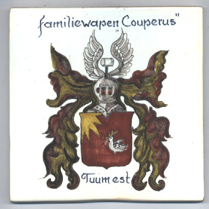
On the right is an image of the Couperus Coat of Arms as depicted on a Dutch tile. At the very top, you can see the Cooper's Hammer (a cooper is a person who makes wooden barrels) reflecting the name of the original John Couper, a Scottish Bishop who fled to Friesland in the late 1500's, adopting initially a Dutch version of his name (Jan Cuiper) and then later "latinising" his original name to Jan Janssen Couperus. This founded the Couperus family name just about the time that formal "Family Names" were becoming fashionable - later they were mandated by the government of the time.The hammer is accompanied by a pair of wings - indicating "flight" both in the sense of travelling through the air (see below about the Dove of Peace) as well as "fleeing". The cognate word in Dutch (vlucht) carries the same dual meaning - and this may well be a deliberate play on imagery and words, where the Cooper's Hammer has undergone a "flight" (i.e. fled, or "gevlogen/gevlucht" in Dutch).
The hammer is mounted on top of the Knight's Helmet, indicating that the bearer carries the privilieges of a knight (or "knecht" in Dutch - later this word changed its meaning in Dutch to where today it has a meaning closer to "apprentice".)
Surrounding the the shield are the Bishop's robes - the color in this tile has changed over time - A Bishop's robes are supposed to be crimson with a golden lining, but this effect has clearly been lost in this tile. A better idea of what it is supposed to look like may be seen in the next image below.
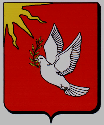
To the left is another rendition of the Family Coat of Arms, clearly done by the same artist. (notice the similarity of the script for "Tuum Est"). This version was recently provided to me by a second cousin (Thank you Haiko!) and gives a much truer color rendering than that of the creamic tile above. Interestingly, the "Gold and Crimson" of the traditional Bishop's robes are rendered more accurately here than in the ceramic tile version above - but gold is a difficult color to reproduce on any medium.
On the shield itself we see a dove of peace carrying an olive branch and flying towards the rising sun (i.e the East as we call it today - although now that maps are commonplace, we think of the East as being towards the right rather than the left on a map, with North at the top.) Why the East? Maybe it has no significance (the poor dove has to fly in some direction - or it could have religious connotations, or it could indicate passage from Scotland to Friesland.)
Then finally we get the motto (or technically "the device" of the shield) which reads "Tuum Est". This may be literaly translated from the latin as "It is to you" or in Dutch "Het is aan jou". This could mean something like "It is up to you" if we were to express it in today's vernacular, or it could simply mean "This is yours".
I found another rendition in the Dutch "Heraldische Databank, Centraal Bureau voor Genealogie". The image provided shows just the unadorned Shield Symbol (Wapen) as distinct from the Helmet Symbol (Helmteken), the Drapery (Dekkleden), and the Motto (Wapenspruek). However, the accompanying text provided by The Genealogy Bureau in The Hague also describes these other components and reads as follows:
Wapen: In rood een zilveren duif, in de snavel een gebladeerde gouden olijftak, opvliegend naar een voorkomende gouden zon, uitgaande van de rechter bovenhoek van het schild. Helmteken: een zilveren kuipershamer met zwarte steel tussen een zilveren vlucht.
Dekkleden: rood, gevoerd van goud.
Wapenspreuk: TUUM EST.
Bron(Source): CBG, Nederland's Patriciaat, 1e jaargang 1910, blz. 86.
(Should you wish to visit the website of the CBG, it may be found at Centraal Bureau Voor Genealogie )
An interesting variant can be seen in the signet ring that Louis Couperus had made for himself.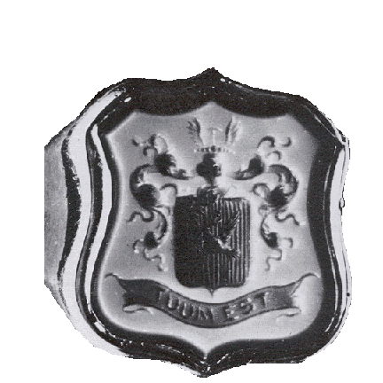
He describes it in a letter in 1894 as follows
An approximate translation would be as followsHierbij een wapentje: zilveren duif met olijftak, die naar de zon vliegt.- het devies is Tuum est.- boven den helm kroontje met 14 parelen (iets heel vreemds in Holland; het is een sheriff-coronet, daar wij van Schotse origine zijn en vroeger Cowper heetten.) De us is van de dominee's! Boven de kroon steekt een kuiperdissel uit: U ziet de origine van Adam af, was dus nog al eenvoudig.Here is a small coat of arms: a silver dove with olive branch, that is flying to the sun.- the device [motto] is Tuum est.- above the helmet a small crown with 14 pearls (something very strange [unusual] in Holland; it is a sheriff's coronet, in that we are of Scottish origin and used to be named Cowper). The us is the preacher's! Sticking up above the crown is a cooper's shaft [malet or hammer?]: you can see the origin is from Adam, so therefore pretty simple.The use of the word "sheriff" here refers not to the western gunslinger type of individual, but rather a person appointed to be the principal agent of the Crown responsible for the administration and finances of a specific county or shire in Britain.
Also, the sheriff's coronet seems to be an embellishment devised by Louis Couperus himself, I have not encountered it anywhere else. It is also curious that he chose this coat of arms for his signet ring, as his direct ancestors (the East-Indies branch of the family) had developed and used an entirely different one based on three dolphins.
Here is an image scanned from a photograph that was sent to me.
I do not know the source of this depiction, and clearly the "original" is a cruder execution than the tile above. Nevertheless it is useful to have as the artist (whoever they were and whatever the source of their information) had a better idea of the coloring traditionally associated in heraldry with Bishop's Robes. Unfortunately, the photograph as received by me has cropped some of the edges off, but one is gratefull for whatever one can get that sheds more light.
There is a good chance that the source for this artist was the same as that for the the tile above - note that the title text at the top of each image is remarkably similar in its overall layout and style.
How genuine is this coat of arms? (Stated another way - is it the figment of some ancestor's fertile imagination who aspired to blue blood, or even worse - some commercial entrepreneur who sells the result of his research to gullible Americans?)
Well it turns out that a number of variants of this coat of arms are recorded through history, but the image shown here appears to reflect partly the description of the design associated with Ds. Petrus Theodorus Couperus as recorded in Het Wapenboek en Wapenbord van de Libryemeesters te Gouda of 1767 wherein the first part of the description reads:
So here we have the dove flying to the left, as in the image above. However, in another description we read of the sun being in the top right corner -Doorsneden I: in rood een naar links opvliegende duif van zilver met een groen takje in de bekThe consensus of a number of Dutch researchers is that some branches of the family took the original coat of arms and embellished it for use as personal seals - returning themes in these embelishments are three oak leaves and a dolphin. The latter in particular is found in the seals of the "Haags-Indische" branch of the family that eventually died out. But the original design appears to consist of at least the cooper's hammer on the helmet together with the "flight" wings, the sun, and the dove with the olive branch - these themes are seen in all the embellished versions that appeared later in the 1700's."... In rood een duif van zilver opvliegend naar een kwartzon van goud in de rechter bovenhoek van het schild, de duif heeft een gebladerde olijftak van goud in de bek. Verkroonde helm; helmteken: een vlucht van zilver, waartussen een rechtop staande kuipershamer van hetzelfde op zwarte steel. Dekkleden: goud en rood. Wapenspreuk: Tuum Est.